Hey guys,
Here’s my first project adapted to Sparkle (i’m still prototyping the responsiveness, but any 16x9 screen will see it normally).
Feedback much appreciated!
Hey guys,
Here’s my first project adapted to Sparkle (i’m still prototyping the responsiveness, but any 16x9 screen will see it normally).
Feedback much appreciated!
Gorgeous website and lovely images. I feel there should be a “Home” button or some sort of navigation - despite the limited number of pages. Would feel more complete for me as a visitor / user.
Thanks for the feedback, jazz!
Noted! I’ve decided to keep the logo as a “Home” button for the simplicity, and my thought process was to lead the visitor towards our CTA button on either of the pages. Perhaps a “go back” button above the title may be a good addition!
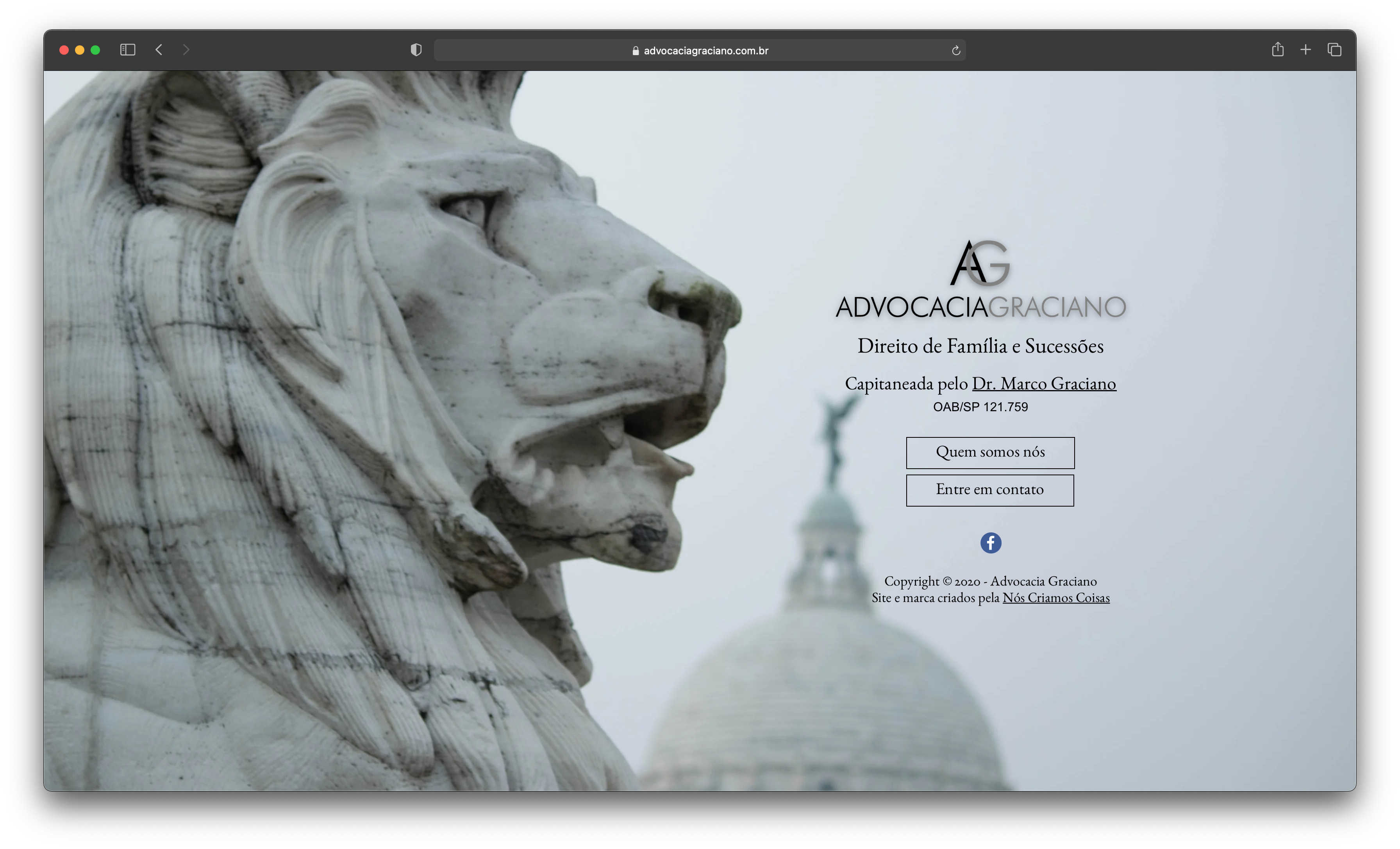
Good start, but on my large screen Mac, things tend to shift, so that your title sits partway over the lion’s nose and is thus hard to read, plus there is a large white area to the bottom. I’ve attached a screenshot
Hey j!
Amazing, thanks for the feedback. I’m still trying to figure out a way to have the box to fill the entire viewport - but probably i wont be able to do that with devices that have a superior width than 1200 px, only with lowers… care to share your resolution for cientific purposes?
thanks a lot!
I have an Apple Thunderbolt display 27". Resolution is 2560×1440
Hi primo,
the problem is that you used image as a custom pattern background which is not being scaled when changing resolution.
I too like using images as background but you have to be very careful.
Hey z!
Yep, i understand that. To achieve the aesthetics I’ve proposed to the client (each page in a single view) i’ve had to use a box (on WP/Elementor, would’ve just set the image as background and it would up and downscale in each device it was loaded). Just trying to figure it out a way to do something like that with the box element. But for now, i’ve created multiple groups for each device and played with hiding where they aren’t supposed to be, such as the boxes not being displayed on smaller devices.
Thanks for the feedback!
@primo Bém feita, bonita e simples.
To fill the entire viewport with a picture,
go to Settings on your project
tick on “Allow HTML element id customization” under Miscellaneous and hit done.
select the image you want to cover the viewport with (make sure you only selected the image, not a group) and in Code integration under Arrange tab, give it an id# for example: hero
add an Embed box anywhere in your project and put the following in Embedded Content area under Style
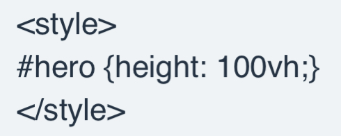
then hit Save. Make sure you tick “Content expands vertically” under the Save button.
Hey Nathan!
Thanks for the tip, i’ll try it out 
