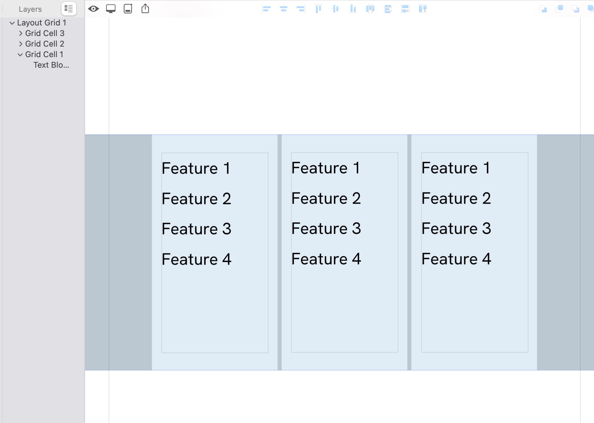
One of the most important things I need to put on my new marketing website is a simple “comparison table” to showcase features of different service offerings.
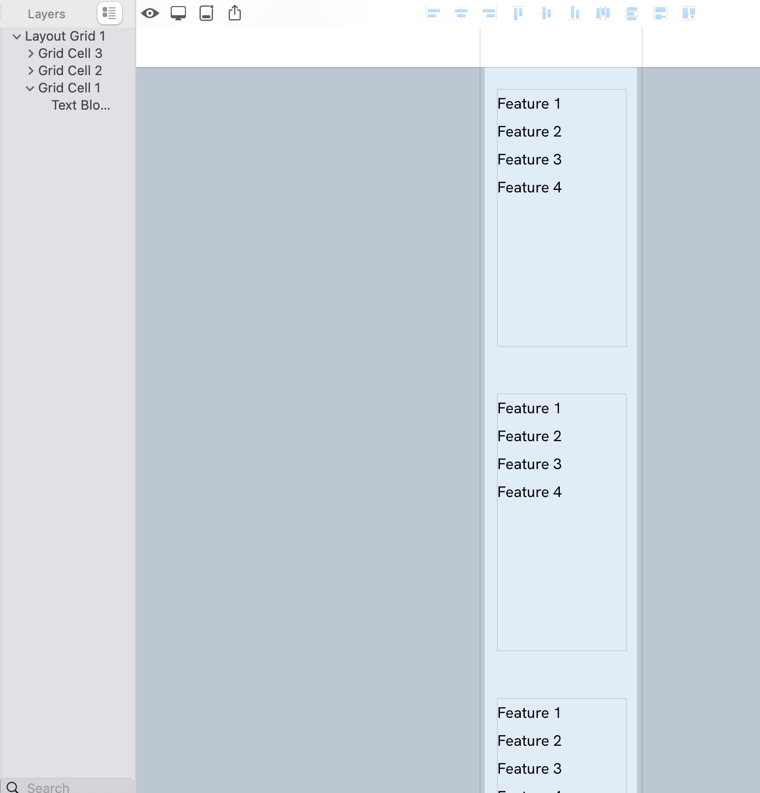
I’m not concerned with creating one for desktop, but making sure it displays properly on mobile or, if I’ll have to come up with an alternate display option for mobile.
The layout is vertical with a maximum of 3 service offerings with the lower “blocks” or fields which service level has which features attached to it. We’ve all seen these, just want to make sure mobile can display it properly or not.
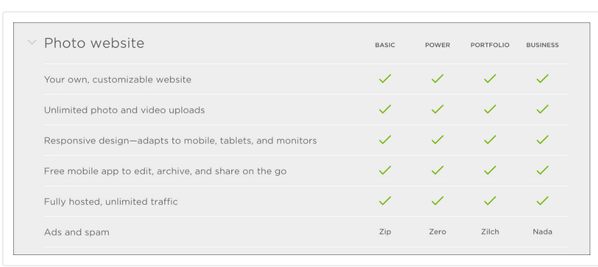
I should have sent an example…enclosed. I don’t need an exact match but yes, your grid tool sounds like the right fit. I’ll have to experiment with layout/design to get the right fit. I’ll report back with what I come up with so others can figure this out too.
Mobile adaptation of a table is unsatisfactory regardless of the coding technique. There isn’t any way other than manual adaptation in Sitely but also if you view hand-coded tables there isn’t any nice way to do it as far as I can tell.