I wonder if it is possible to copy a finished layout (i.e. from Desktop size) to Tablet and Smartphone size to edit it easily for each size?
I’ve worked with. Adobe Muse for years now. There it is possible to transfer a design to a smaller breakpoint (i.e. Smartphone size) and adjust it in there later easily.
Is this possible with Sparkle or do I have to touch each size again and reconfigure everything in it?
Sorry for letting you wait - also coming from Muse it is kind of the same procedure in Sitely (how it is branded recently). You cannot copy but must reorder for each device/breakpoint.
In Muse we had been able to kind of copy design from one breakpoint to another breakpoint to have less struggle in reordering elements - this is unfortunately not possible in the same way - what one can do - let sparkle first do its “automatic scaled” approach which is mostly not what you want because especially with text it does not as intended/expected but scales text down to a not reasonable sizes which could end at a size of 2 pt for mobiles or if you start at mobiles, ends at way over 100 at desktop layouts. But anyway - I recommend to do breakpoint by breakpoint with each device.
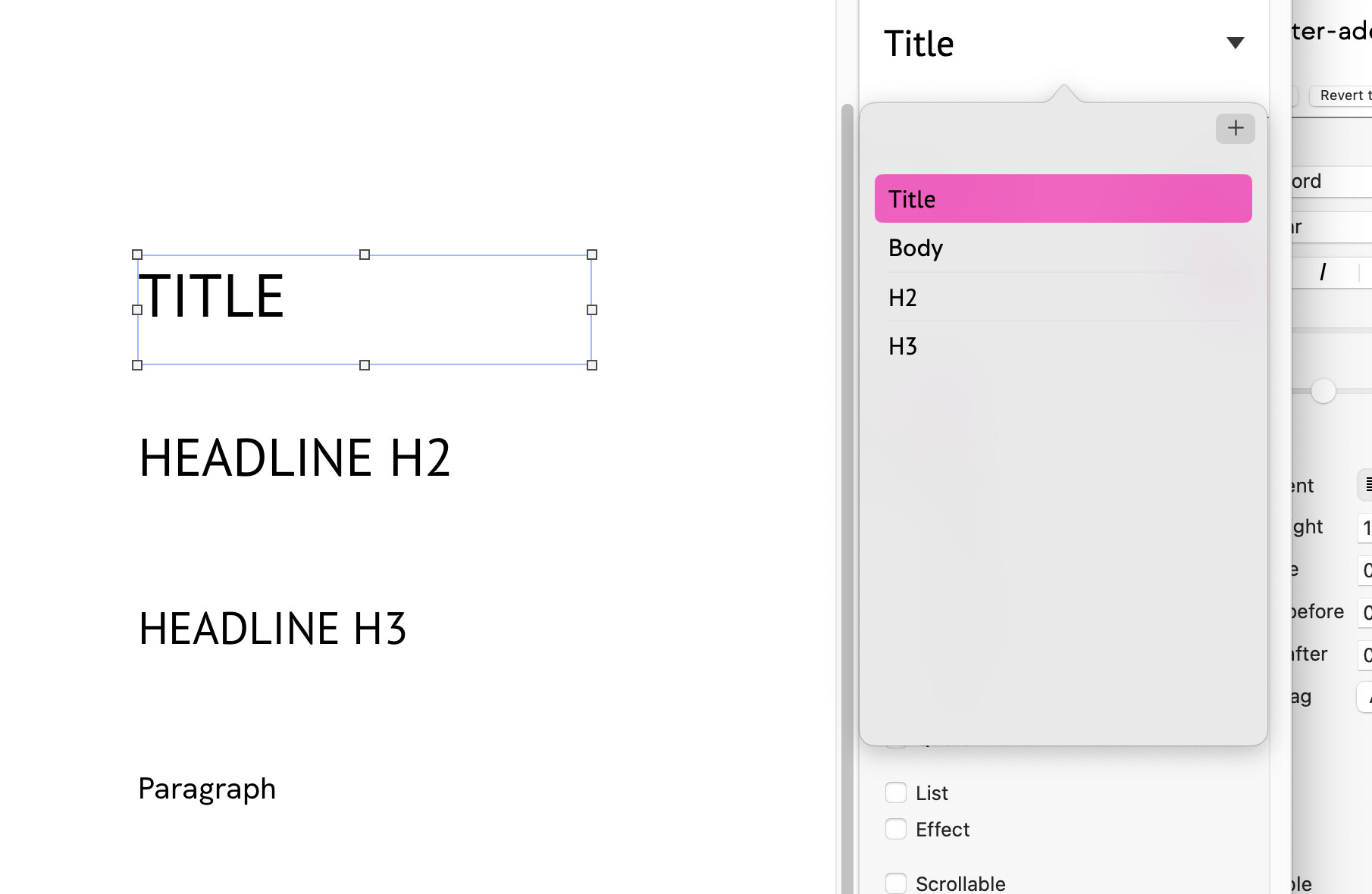
If you start from scratch, I highly recommend to apply text-paragraph styles first for all breakpoints in order to have very less struggle to handle text across all devices.
What we had in Muse is kind of the same here, using paragraph styles.
But as Sitely does not apply the paragraph styles automaticaly you must apply that one to your text on the new device(s) in order to have it correctly as intended.
Sitely does not remember that it used H1 on 1200 and uses the same style for 320px H1 - you must tell Sitely to use that style here as well.
For images also I recommend to go one by one from device not set to automatic to custom
You may skip the automatic part.
As I am not sure, if this a beta thing - it gets or is even better, since the textbox has the size to fit in as soon as one double clicks on the bottom handle of text box(es).
Hmm … working with those styles right now and figured out that text styles created for the tablet size are the same as for the smartphone horizontal size. It seems that it is not possible to define separate styles for each size. Maybe a bug?@duncan
Usually I enter the device size, for example Desktop PC, and than I define Headline 1, Headline 2 and the Paragraph styles. Then I enter the Tablet device view and define the Headlines again and the Paragraphs too. And so on. If you create separate styles for Smartphone horizontal and Tablet, they are not independent to each other. The chosen style, e.g. Headline 1 for Tablet, is overwriting the style from Smartphone horizontal. Do you now what I mean?
Edit:
Aaah sorry guys - it is not a bug, just misunderstanding from my site.
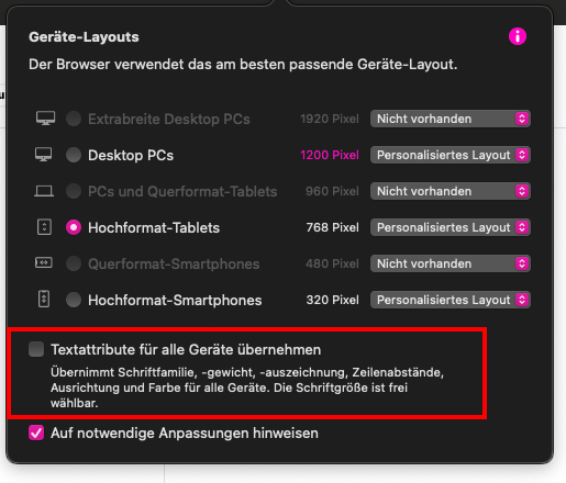
Perhaps for future beginners starting with Sitely like me, here is a screenshot (in German) to help you understand: You have to uncheck the field like shown in the screenshot, otherwise applied text styles in any device will be changed
