Hello, I come to this forum to give feedback and give proposals to improve Sitely.
First of all, Sitely is by far the best website design application on the market, extremely flexible and customizable. This app is really easy to use, but there are some missing elements that disadvantage Sitely.
Layout: indeed, we are quite limited with the layout, unlike Muse, Blocks or Webflow. Sitely has a non-edge-to-edge layout, which creates spaces on the left and right. This makes sites less immersive. It’s about computers; on mobile and tablets, the sites are on board.The animation at the passage of the mouse indeed the animation of the images at the passage of the mouse, or even the buttons, with more animation for the buttons would be niceAn automatic rule to facilitate the spacing of elements on the page by indicating the pixels between each element indeed the lack of this tool makes can organize despite the use of gutter to organize the elements on our page.
But if there are two improvements that I find urgent, it’s the edge-to-edge layout, like on Webflow, Blocks and Muse, and a rule for regularizing spacing by indicating the pixels that separate each element from the web pages. The addition of these two functions in Sitely 6 or 5.x will make Sitely a serious competitor to Webflow, even though I find Sitely already very simple and complete.
As you, Sitely for me is a standout and so easy to use! From my experience it has taken a different take on website building, adhering to the fixed-width responsive layout. This is what Muse had initially and then they changed over to fluid-width responsive and wasn’t that fun!
Sitely has preset fixed breakpoints (and you have manual control over most of them), so when you increase or decrease the width of your browser it will show left and right margin until it hits the breakpoint assigned. But in saying that Sitely presents pixel perfect layouts everytime!!!
For me I have gotten around the pixel perfect measurements between elements when I move them. After a while your eyes do the pixel perfect job.
I do like the idea to have the ability to stick elements to the edge of the browser window and I’m sure it is being considered by the Sitely Team. But creating an edge to edge layout is very possible in Sitely with a bit of thinking outside the box. Check out one of my posts on the subject with a working demo site to look at…
Thanks for your reply. Indeed, what you said is true: by introducing the right measures, we manage to have a site on board, unfortunately for a specific screen size. But as you mentioned, maybe in future updates, this feature (the edge-to-edge feature like in Blocks) will be integrated.
Full-width layout: I’m not sure if full edge-to-edge layout support will ever come to Sitely, as it goes against the way the tool is currently designed. Unless the developers manage to make the layout adapt fluidly to every additional pixel of width, but I’m not sure how feasible that would be…
That said, we could imagine an intermediate improvement: the addition of more automatic layout breakpoints between each device size, to achieve a smoother result across screen sizes. It wouldn’t be a perfect solution, but it would help reduce the issue. In any case, if you want to minimize side margins, make sure to activate layouts for all device sizes.
Stick an element to the edge of the page: This is possible using popups, but the element will stick to the browser window, not the site layout itself. There’s a workaround to mimic this behavior, but it’s not ideal.
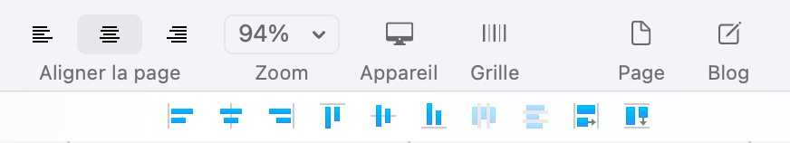
Spacing and alignment: To space elements evenly or give them the same dimensions, try using the alignment tools available in the top bar once you’ve selected multiple elements.
Also, consider using blocks as visual guides. Personally, I create a block that I use as a measuring tool — resizing it to define the space I want between two elements — then I move it into other sections of the page to adjust elements and ensure consistent spacing everywhere. You can also group several of these guide blocks together to move them more easily.
Often, I keep these guide blocks on a separate (unpublished) page, so I can reuse them later if needed.
Sitely certainly has some limitations, but it already lets you do a lot — with much more freedom and simplicity than most other tools!
Unlike yourself and Fig, I’m not a pro web designer, but I have done my research and none of the alternatives to Sitely you mention are anywhere close to a replacement - or for many reasons, not even direct competition.
For example: Muse is no longer a supported platform and died about 4 years ago. Both Muse and Webflow are the “pay us forever” pay plan, vs. actually owning the version software currently available. Not anywhere close to the single-purchase license option with Sitely.
While Blocs might have the edge-layout you’re concerned with it does NOT offer the total free-form layout possibilities of Sitely. In point of fact, you’re locked into the various “blocks” structure of that platform.
Back during the “Sparkle” days I created a design that I liked and tried to replicate it in Blocs, and that was the defining moment that kept me from purchasing it, because Blocs forced me to design within each block and there was no way to get the look and feel I wanted (and easily achieved) with Sparkle.
Webflow to me is just another web-based tool. I see no difference between it and WiX especially now that WiX has expanded it’s core offerings with literally everything Webflow offers, and more with integration to other web-tools such as Canva. But again, it’s a never-ending “pay us forever” schema where you have to either pay monthly or yearly. Not cost effective.
No tool is perfect and the whole point is to pick the best tool that fits your needs - and your budget. There are dozens of beautiful sites made on the Sparkle/Sitely platform, none of them lack functionality or visual appeal because of this so-called issue.
I find this “help” about the edge-to-edge issue to be nitpicking and almost smacks of trolling. It’s useless information. If you feel it’s a major flaw, contact the devs directly.
Hey all, we’re well aware of all the issues and tradeoffs mentioned, no worries.
Regarding edge-to-edge I think the question is narrowly about the feature itself, it is legitimate to ignore other aspects such as whether the tool is web based or what the pricing is, when you’re striving to achieve a specific result.
What is mostly ignored in the discussion about layouts that follow the window size (horizontally or vertically), is that there’s a tradeoff between simplicity and flexibility.
There are essentially three ways to solve full width layout, and you can see this in the different tools on the market:
a tool can offer pre-built components that extend to the full page width, with built-in behavior on how this will translate to a mobile layout; this gives you immediate satisfaction but you’re generally stuck with a canned layout (not much space for creativity) and canned behavior (the mobile layout is pre-determined), with relatively limited space for customization; sometimes these tools offer ways to use code, like say adding CSS, which requires a deeper understanding of what the original component does and how was built, or the willingness and ability to troubleshoot it when things don’t work out; this is not really our cup of tea
recognizing that different browser window widths will result in different layouts, the tool might offer access to the underlying browser CSS grid features, perhaps combined with breakpoints, which even when exposed in a pretty UI is a 10x complexity jump in understanding and being able to predict what will happen, which implies again lots of trial and error and hours spend debugging; again not something we’re too keen on
some tools just let you do full width layouts with no specific provision for how to handle a layout at different browser widths, ultimately necessarily exposing the user to understanding/troubleshooting the layout CSS for anything but the most basic layout
The complexity in all 3 the above is what has brought us to the sad state of every website being identical to every other, no creativity, and unfortunately no thinking outside of the box on what might be possible outside of two or three standard layouts.
Just to reiterate something I/we have talked about extensively in the past, we’re all for coding, we code every day, it’s just that the “coding is easy” mantra, which is absolutely true by the way, should be followed by “if you have the time to learn it properly”.
Sitely’s goal is to eliminate as much as the complexity and jargon as we possiblly can, arguably still doing a terrible job at it, but we think we’re better than everybody else at this particular task.
The full width layout question is not just “can it be added”, but “can it be added in a way that still understandable without delving into code/complexity/troubleshooting”. Yes we want to do it, but it’s not a trivial addition.
Indeed, the multitude of screen sizes requires a specific tool that cancels out the creativity and ease of designing a site as proposed by Sitely. The most important thing is to offer a product that is simple to use, with the minimum of compromise. The edge on board is feasible, but at the cost of a complexification of the tool, which is not your goal. Sitely’s success lies in its ease of use.
Thanks again for your clear and honest answer. There is no perfect tool, and everyone has their advantages and disadvantages.
But what made me make this suggestion was the feat that you managed to do from edge to edge with the mobile. I thought it was impossible on computer devices and big screens. A partial solution was found: to put your own resolution in order to get on board. That’s the resolution between the two sizes. If it were possible to automatically scale between predefined devices, that, I think, could solve this problem.
To clarify, I’m not implying that we don’t care about full width layout and don’t want to add it, just that the approach of other tools is unsatisfactory, and we need to find a better compromise in the context of how Sitely works, meaning a solution that doesn’t give up on ease of use and creative flexibility.
Exactly, if you haven’t introduced it, the result doesn’t satisfy you, because your goal is to create an easy-to-use tool. Moreover, it is clear that you are concerned about the problem since you can edit the size of the devices: computers and large screens, the two screens that do not make edge to edge.
Also, centered content web designs are trending for the past couple of years, and it is useful especially for those big width screens. That’s something to consider if you’re looking for a modern design too
Yes, I have seen some monstrosities where the fluid-width website stretches the 38’ monitor… not a good look! So there is a lot to say about the centered content web design paradigm which even the big players use, like Apple has adopted. Also it seems like Apple has a few fixed-width breakpoints in their layout design nowadays.
 So there is a lot to say about the centered content web design paradigm which even the big players use, like Apple has adopted. Also it seems like Apple has a few fixed-width breakpoints in their layout design nowadays.