I really enjoyed making the new version of my site with Sitely- thanks for a great app.
The last time I made it was six years ago- and the web has changed a lot since then and so has Sparkle/Sitely, so it was a real learning curve getting up to speed with new tendencies.
Please take a moment to have a look and give some feedback,
Thanks in advance, much appreciated.
1 Like
Thanks for your time abra100pro, and the kind words,
I’m thinking of moving the text over the photo to underneath for starters.
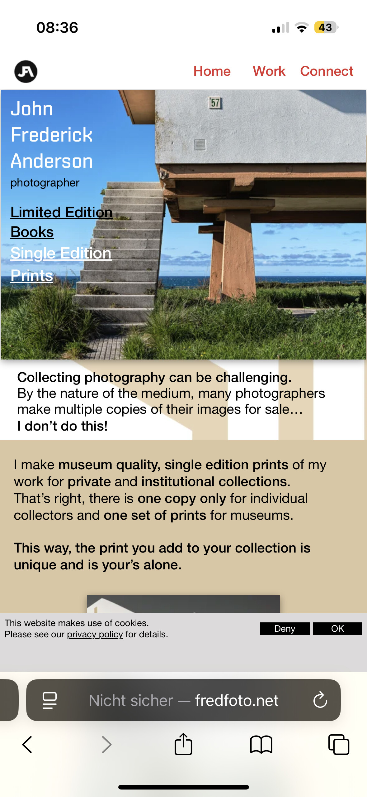
Hi @jfa,
Be careful — your site doesn’t force HTTP to HTTPS redirection, which can trigger a “Your connection is not secure” warning message in some browsers. I recommend fixing this small issue if you don’t want to risk losing visitors.
Some hosting providers offer an option in the server settings to force this redirection. If not, you’ll need to do it manually by editing your site’s .htaccess file (since, after checking, it looks like your server is running on Apache).
Here’s how to do it manually: you can check out this topic to see the steps to follow:
1 Like
Thanks Allan, the server provider has fixed this, after much trying… appreciate the heads up.
1 Like
Hello jfa,
If I can give you some advice:
-
Search for more typed, more personal fonts. There is already choice in Sitely and the Google catalogue is well stocked. A cast iron without a tie or stick will work better for reading. That’s what you used.
-
The layout of the text: the paragraphs of words and sentences are too large compared to the images. Reduces the size of the typo a little and leaves more emptiness around.
-
Your titles in the different boxes are too heavy. Let the images speak.
-
If you want I can show you examples with a page from your site…
-
And sorry, it’s the reflex of a teacher… that I still follow…

1 Like
A pretty good result @jfa ![]()
![]()
I see you have themed in a “grid” graphics which I see in your photography, but I feel it clashes with the elements and text that sits on top of it. Have you tried to reduce the transparency to see how it looks?
I also feel the captions on your images are too large and is challenging the image graphics it sits on.
Your Work project results page is nice and clean which is great but doesn’t connect well with all the other pages, plus I think it would be a great idea to have navigation at the base of the page returning a user back to your “Works” page, or the next/previous project pages.
I’m not sure if you intended it, but you have blank space below your footer section on all your pages except your project pages.
1 Like
Thanks thc2603 so much for the feedback, I’m a teacher too, so no worries, I know where you are coming from.
I’ll look at more serif fonts, I see what you mean- and look at size reduction for the text sections.
Yes, a few examples would be very kind.
Cheers
1 Like
Thanks FlaminFig, I leave a bit of white space at the base of the page, maybe I’ll have the footer or final section butt up- seems a bit abrupt, but I’ll take a look.
I hear you with navigation, I’ll design up a back or work button.
Cheers
2 Likes
Buenos días, siendo una página dedicada a la fotografía los elementos tipográficos, iconos y fondos no deberían prevalecer por encima de la fotografía. Un estilo más minimalista sería lo más adecuado desde mi punto de vista.
2 Likes
Hi again,
I re-did the site with all the advice and feedback taken into consideration.
I also didn’t like the first version so much after it was live for a while- there was a lot of distraction, and I felt I was following a design language that was formulaic and not ‘me’.
I put a new version up today at the same address, cleaner and more ‘white and bright’ so I’m happier now.
Cheers, JFA
1 Like
Hello,
Well, it’s much better, I love it ! If you’re still open to improvement suggestions, here are a few:
-
The “Menu” button centered on the left is an original choice, but it’s not something you often see on a website. I would recommend making it stand out more, as it’s a bit hard to spot. For example, you could add a background or a colored bar that matches the height of the browser window.
-
The off-center content on the homepage is a bit confusing, especially since the content is centered on the other pages.
-
The “Next page” buttons could be a bit more visible and placed slightly higher.
-
Optional but nice to have: a small animation when the menu opens, for example, a “slide in from the left” effect.
And one last thing: I recommend creating a contact page with a form to hide your email address, if you don’t want to be flooded with spam.
1 Like
Thanks so much for taking the time to have a look.
I’ll take what you say on board- great advice.
1 Like