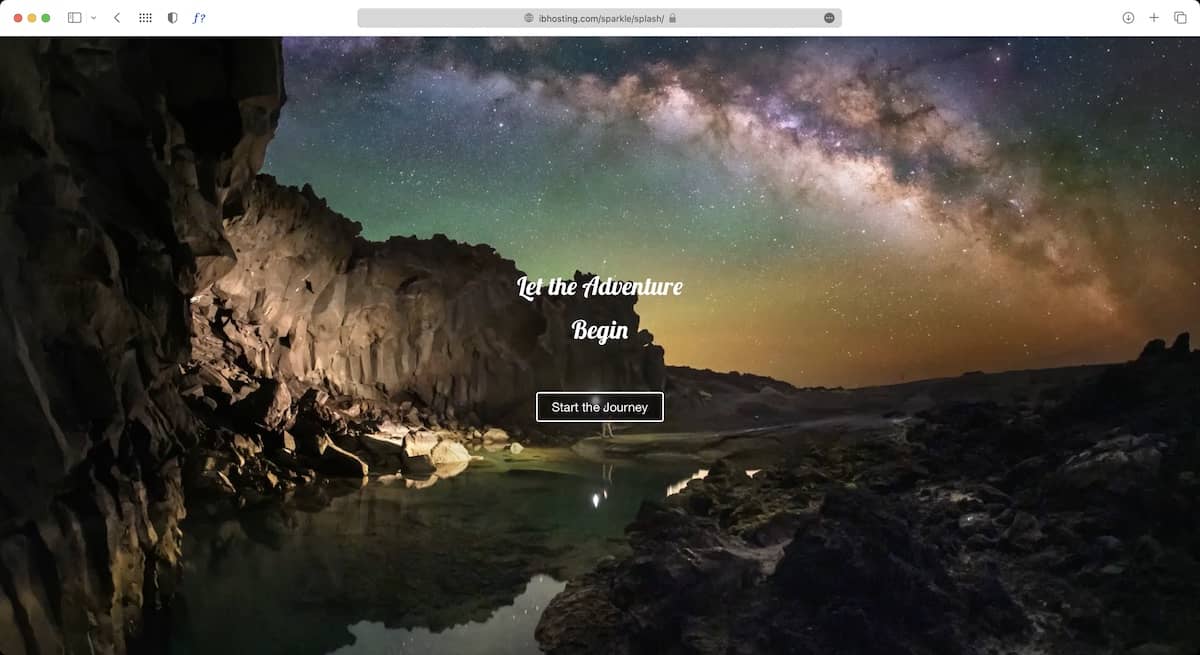
We’ve all encountered websites that display a large, full-screen page upon arrival. These pages typically feature a background image with overlaid text and possibly other information. Notably, the entire page remains a full-screen image regardless of the browser window’s size.
While I’m not a huge fan of this design, I understand that some people prefer it for aesthetic reasons, especially on websites with an artistic theme. Below is a link to an online tutorial that demonstrates how to create these types of pages easily in Sparkle. Just click the image to get started.
1 Like
Why?
Thanks for the tutorial. But it’s just a workaround. In fact it is not possible in Sparkle for now.
Espacially most users will have content after the fullscreen image.
To design it as a One-pager is not that elegant.
Instead of trying so hard, you can click here. 
This is just a suggestion… I wish there was such an option. (;
4 Likes
This is one of the reasons I’m not a big fan of full-screen intros on websites. They often create an ‘illusion of completeness,’ making it necessary to indicate there’s more to see. Sometimes this is done with a simple ‘down arrow’ icon or a button that links to the next section. Either way, users need a hint about what to do next. From my experience, it doesn’t really matter to users whether they click a link to scroll down or click a link to go to a more traditional pseudo home page. The key is to ensure users don’t get lost because they don’t realize they can keep scrolling.
But hey, what do I know? Design is very subjective! If someone really needs this kind of design, at least we have a workaround until such a feature is built into Sparkle.
A very thoughtful workaround! 
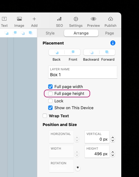
But for me it is OK that I don’t have the ability for full page height for now, although I would love to see it one day in Sparkle…
With a “arrow down” icon showing and grabbing a Users’ attention to scroll down, it is a natural reaction as they were going to scroll down anyways. But to click on something to go to another page is a page too many for a User wanting to interact with your content asap.
Splash pages are a relic of the bygone days and one that only exhibits frustration for the User.
It is something I always steer my clients away from!