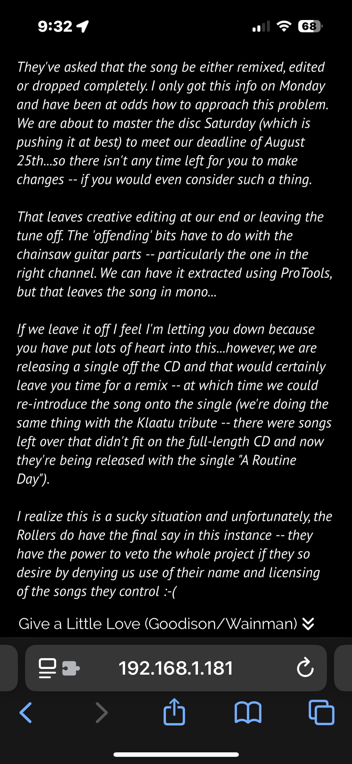
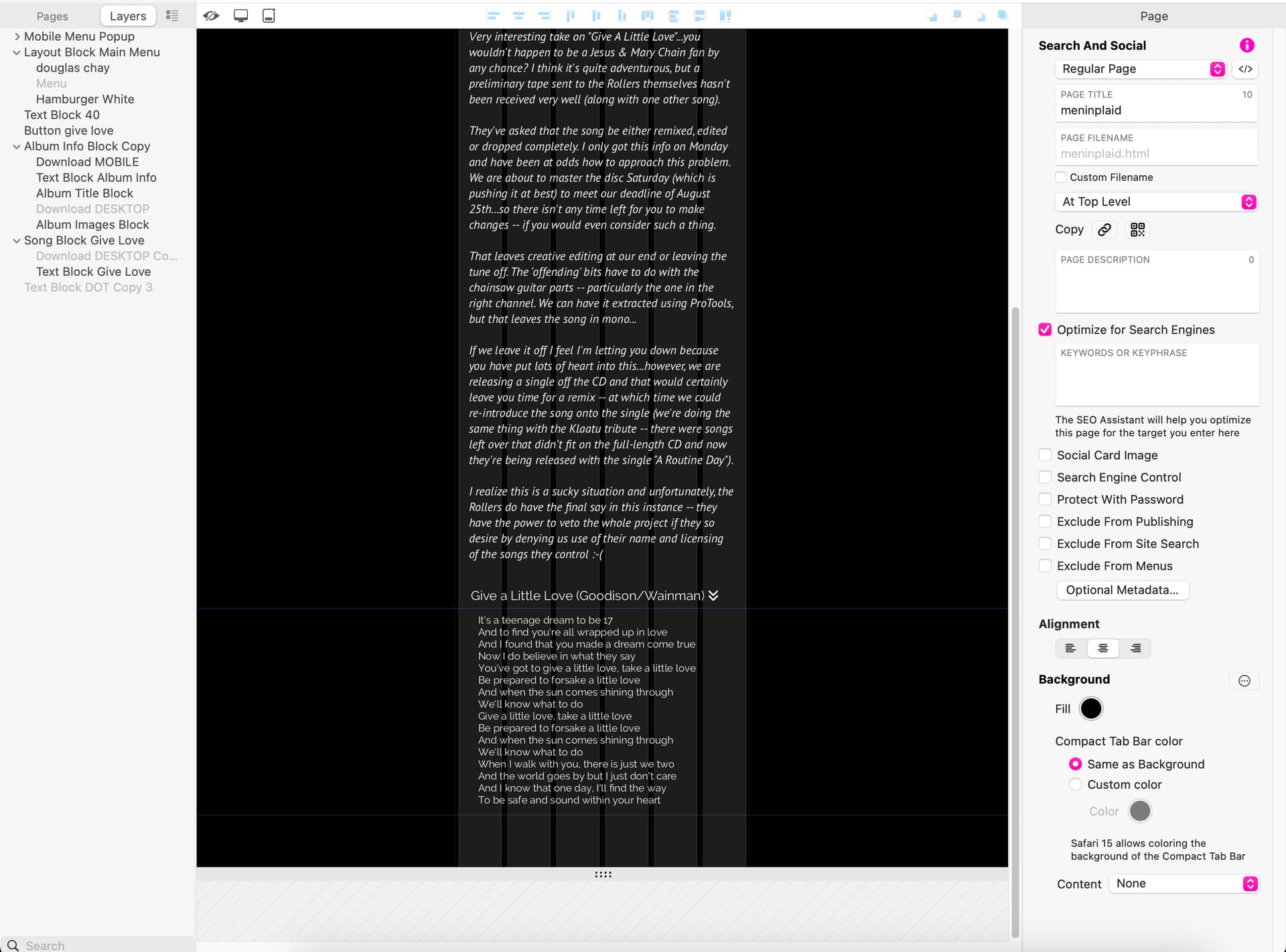
I’m experiencing a difference in a spacing among my WYSIWYG design vs. the Current Preview display vs. All Devices preview. Here are images that show that there is a difference in the amount of spacing between the bottom of the paragraph vs. the last line (button) at the bottom (text: “Give a Little Love).” What am I doing wrong?

If you turn off this feature from the site settings, you will see it properly.
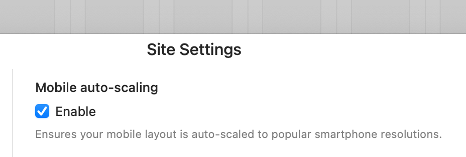
Of course, when you turn this off, you will lose the ability to automatically expand for mobile devices of different widths.
I tried turning unchecking it and yes, it showed up reflecting what had designed on the canvas. But, I need the ability to automatically expand for mobile devices of different widths, so this solution wouldn’t work for me. Anyone?
I do not think it will be a different solution since it increases the width of the text box according to the width of mobile devices.
If there is a method, I’d like to hear it too.
Presumably you have a very long text block. The only fix is to break it up in multiple blocks to spread the spacing across multiple boxes.
The gist of the problem:
- in Sitely you design for a 320 pixel width
- most smartphones are anywhere between 360 and 450 pixels wide
- Sitely introduces a small zoom factor to the page to scale up 320 to the actual device width
- this results in the actual text size being a fractional pixel size instead of a round number, like say 14.35 pixels, instead of 14 or 15
- similarly the spacing between lines is a fractional size
- iOS prior to version 17 gets both of the above wrong, iOS 17 only gets the second wrong
After we filed a bug with Apple, they fixed the first in iOS 17, and they have recently acknowledged the second. We’re hopeful that it will get fixed in iOS 18.
1 Like
Yes an iOS Safari annoyance!  Sitely’s zoom works faultlessly on Android.
I wonder if there is also a “small zoom-out factor”?
Is using the 320px view port more for compliance reasons? Across the world (stats. wise) 360px width seems to be the lowest on average when it comes to viewing on mobile devices.
But in the end it is great news to hear Apple is acknowledging the issue! I just hope they act on it!!!
1 Like
Even if the text block is short, words that match the end of the line can fall on the next line.
If we could set the minimum width on mobile to 360px as @FlaminFig said, wouldn’t this problem disappear?
1 Like
The text wrapping slightly differently actually can always happen.
The text block was 618 words. I split it up into 2 and I’m still having the same problem, except the two text boxes, where they connect, are overlapping each other and when I separate them on the WYSWYG canvas to look like they should, what shows on the iPhone is a horizontal distance between the two that shouldn’t be there. If I overlap them in a certain way, it shows up correctly on the iPhone, but with a red rectangle on the WYSIWYG text box, with text disappearing beneath the ends of the text boxes. Is this the workaround? I am reluctant because it shows as a text error on the canvas, but if it will be consistent when I upload the site, it might not be a problem. Anyone?
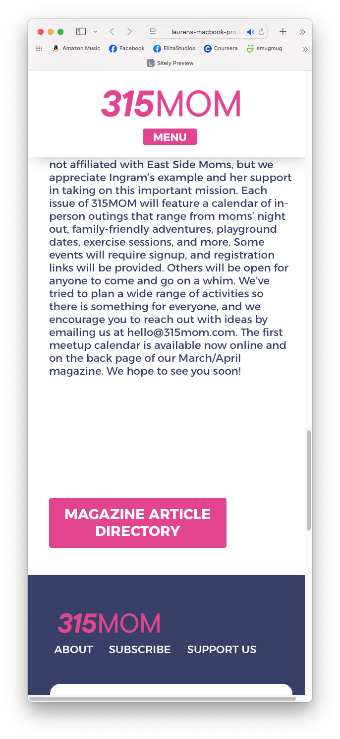
This is a really annoying issue. Even with a separate layout block, there is a HUGE gap between the layout blocks and this only problematic on the mobile view. See my examples.
This seems to only happen towards end of my layout.
![Screenshot 2025-02-11 at 2.40.55 PM|690x491]
(upload://ssiWWoQl6mOCkL5OaqdJJ0g0KLa.jpeg)
1 Like
Have you also checked in other mobile browsers like Opera, Firefox, etc… to see if you get the same result?..
It’s all the same Firefox, chrome, etc.
1 Like
Ok… Have you tried having your pink button inside the Layout Block and see if it behaves?..
I have tried everything I can think of, inside the layout block, in its own layout block and nothing works. There’s always a big gap and the only way to fix it is to overlap the pink button on top of the text, which I rather not do.
Ok it might be a good idea to let @duncan know via email - feedback@sitely.app explaining your situation with the Layout Block…
Did you resolve this issue? I don’t see it happening on your site now.
No, the site you saw online is not the one I am currently working on. The current site works because of the fixes I made to the copy/text at then end to compensate for the problem. I will email Duncan. Thanks for your help!
1 Like