I am watching todays’ Apple WWDC keynote and am wondering if Sequoia’s iPhone mirroring capabilities offer a Sparkle opportunity?
Speaking ignorantly, does it offer Sparkle a better way to develop the mobile versions of Sparkle pages?
On the face of it and relative to my current workflow, I can see myself viewing my test site on the mirrored iPhone view instead of having to physically going back and forth between my laptop and iPhone.
I know what you are saying @DaverD, but we can mirror our mobile device on an iPhone device and even on an Android device. but I hear that it is frustrating you?
I’ve been keeping my fingers-crossed-crossed-crossed to see (within the Sparkle app) my mobile device on canvas sit alongside my 960 device on canvas. As Sparkle is a full on visual development platform for websites it would make sense to visually see what is going on in mobile while we adjust things on the 960 device and vice versa!!!
Let me add that I wonder if the writing tools also provide an opportunity. Written content is in everyone’s site - mine in particular as it is a blog (DecarbToday.com - shameless plug ).
Since Safari removed the option to have the website preview in diferent sizes it has been so difficult to get things right without getting the physical devices and trying it. I think Sparkle should integrate a custom preview window with some screen typical sizes (iPhone, iPad,…) to choose from and toggle between.
Yes Safari thought to give us far better options because now we can manually drag the desired screen size but most of us don’t know them so it is a useless feature unless you are knowing all the devices. It is also the signs of the times as their are 100s upon 1000s of differing device screen sizes!!!
There are other browsers that still have it so you can pick a predefined setting still with them.
For most part (because Sparkle is so pixel-exact) I turn off the grid (by using the tab key) and get a rough idea of how things are looking instead of always viewing it in Preview.
Towards the end I view everything in the actual device to make 100% sure before I hit Publish!
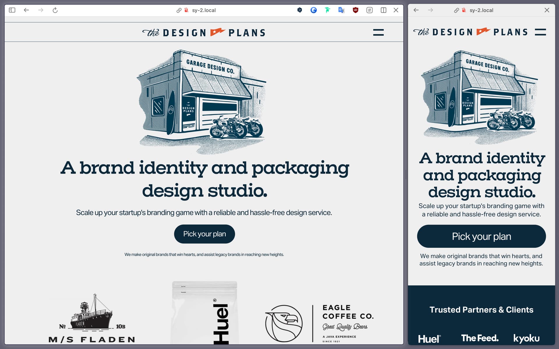
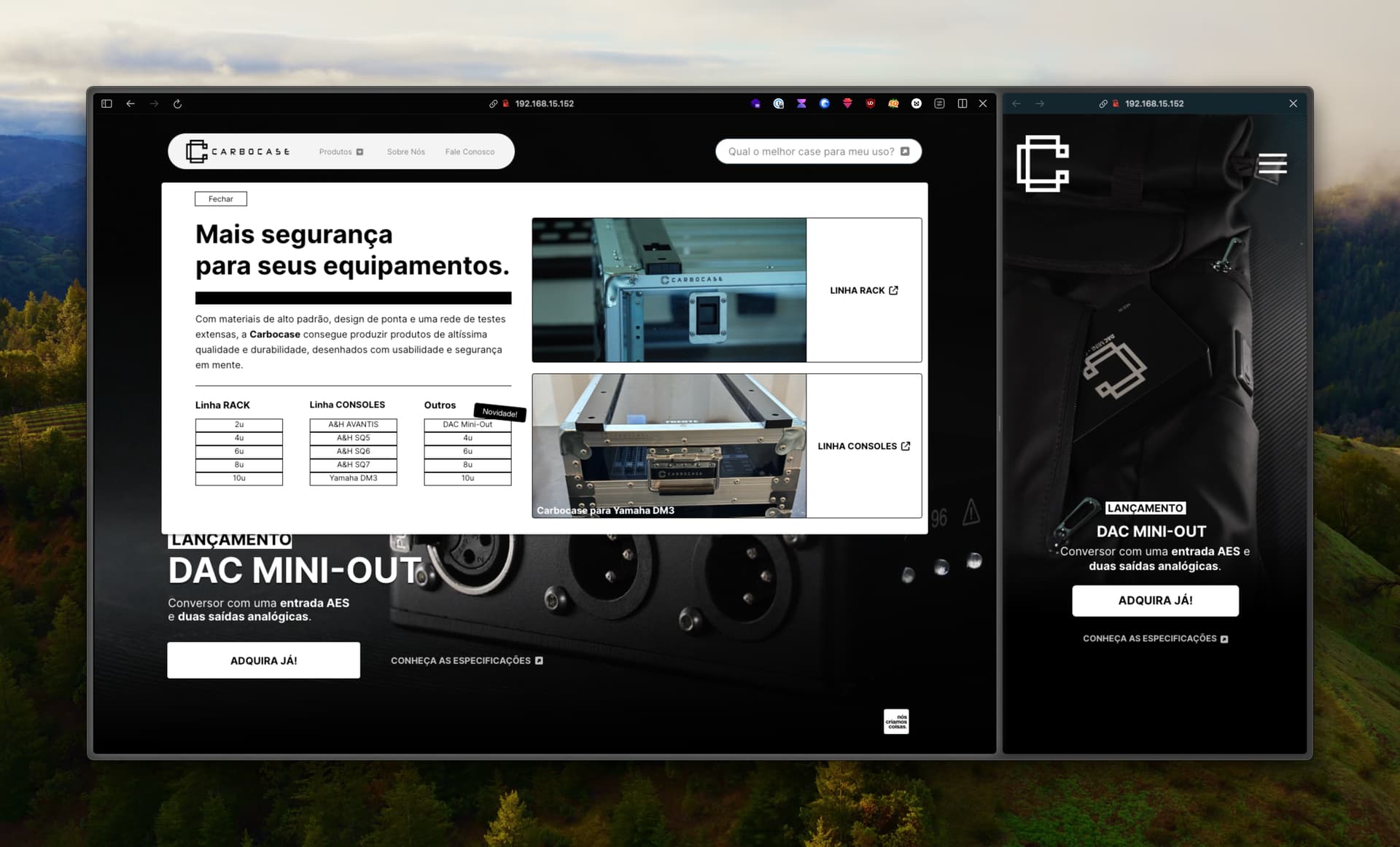
I am using Arc Browser. After creating a preview browser, I open the same link again in a split format and bring it to mobile width. I can view my work on both mobile and desktop at the same time.
@FlaminFig creating an account enables you to sync Spaces between devices, and each Space can have their boosts and profile linked. Profiles are quite useful for agencies like us, you can have a profile setup for a specific brand/company thats you work with and have every access and whatnot linked in that profile, then do everything you must and then come back to your usual profile and space. It’s a pretty neat browser and super stable for the past 2 years i’ve been mainly using it. You should give it a try, boosts are super super useful
 ).
).