I have many image galleries on my site with lightbox enabled. Is there any way to not have the arrows and thumbnails show on a mobile layout (specifically iPhone?) without them also being ‘turned off’ on the desktop layout?
First site is a photo site document backpacking trips since 1975. Pretty simple.
I just finished my second site, which is more complicated art portfolio. It was originally made with Muse.
Thanks for everyone’s time.
There is a way…
You would hide (untick On This Device) the Image Gallery on mobile and then introduce a new Image Gallery without the arrows on mobile. Make sure you also hide the one introduced on mobile on your desktop.
So the 8 image galleries and somewhere around 100 images spread across pages that are already set up and titled get tossed and I have to make a custom gallery setup for each of these from scratch? That is disappointing.
This is where the user manual is sorely lacking. I feel like a beta tester.
First the information on menu navigation lacks the granular information about making mega menus with popups for menus that are more than 1 level deep.This popup mega menu appears when you click on ‘Portfolios’ in the main menu.
It works but the learning curve was sorta hit and miss to figure placement , resizing etc.
In the ‘Devices’ topic it would be nice to have more granular information about what happens to image galleries and slide shows when Sitley 'conveniently ’ converts your meticulously created desktop layout. I get the change is font sized the rest but to include slide show arrows and thumbnail galleries by default is just dumb. Particularly when the you look at the Lightbox Slide show style parameters and it clearly shows checkbox for arrows with (only on Desktop devices) under the choice of arrow style. One would think that means the arrows only show on desktop versions. That is confusing since that is not the behavior.
So all of this carping aside I still think Sitely is a good choice for non geeks/artits/creatives who want to build their own website. Thanks for listening and for the feedback.
I find the Image/Video Grid works better for me. Titles/Labels are still an issue though.
Hi @Marcel 
The method described by @FlaminFig is indeed the most efficient. You don’t need to recreate each image gallery from scratch. Simply duplicate your gallery (CMD + D), then disable the display of thumbnails and arrows in the version intended for mobile. After that, hide the version without thumbnails/arrows on desktop, and hide the other version on mobile.
Alternatively, this can also be achieved using custom code. If you prefer that method, feel free to send me a private message, I can provide you with the necessary code.
HI @ Allan
Thanks for the suggestion. I’ll give it a whirl and let you all know !
Cheers
1 Like
OK I duplicate for mobile turn off the thumbnails and arrow hide on desktop , show on mobile, got it. The duplicate page on mobile is appended by a 1. I take it that to avoid issues I leave that page name and adjust my mobile mega menu accordingly?
Thanks for all the help and suggestions…
No, it’s actually much simpler than that. In Sitely, you have the option to hide elements based on the device type, all within the same page. Here’s how to do it:
- From the desktop layout, duplicate your image gallery.
- Hide the arrows and thumbnails on this second gallery.
- Click on the “Arrange” tab and uncheck “Show on this device.” This will hide the second gallery on desktop in the browser. If you still see both image galleries in Sitely after hiding the second one, you can click on the eye icon
 (located in the top left, just below your project name) and select “Hide elements not visible on this device.”
 - Switch to the mobile layout.
- Select and hide the image gallery that contains the arrows and thumbnails the same way (in the “Arrange” tab, uncheck “Show on this device”).
That’s all there is to it! 
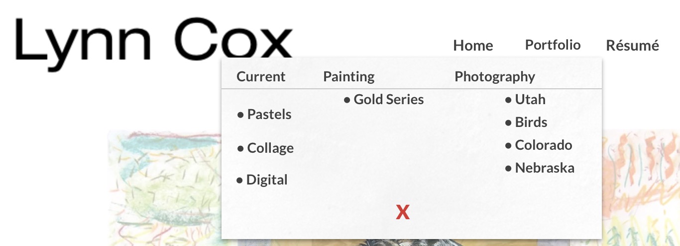
WOW! That is so easy. I’m a bit thick-headed at times. I really appreciate your help. My one last problem was with the supermenu on desktop and mobile. In the resume page when scrolling to the bottom the menu wasn’t visible because it was stuck at the top. I figured out the solution myself. Ah, the learn and burn method. I can’t thank you enough for your help on the image galleries. Easy peasy. If you feel like it, and want to take the time, look at my site. If anything is not working or is wonky I would appreciate your feedback. Thanks again! (https://lynncox.art)
Glad to hear your issues are resolved!
Here are a few suggestions I can offer to improve your website:
-
Automatic menu closing : Opening the menu on mouse hover is a common practice. However, it would be better if it closed automatically when the mouse leaves the area. To do this, you can enable the “Close on mouse out” option in the button settings (under the “On hover” section).
Important: for this to work correctly, make sure there is no space between the button and the popup. However, also avoid overlapping the popup onto the buttons (as is currently the case), since this hides part of them. -
The “Portfolio” button doesn’t lead anywhere : This can be a bit confusing for a main menu item. You could create a dedicated page that groups the different portfolio categories, or change the behavior so that it opens on click instead of hover. Another idea: add a small arrow next to the word “Portfolio” (for example: Portfolio ∨) to indicate that it’s a dropdown menu.
-
Menu organization : Right now, the menu items appear a bit disorganized. Don’t hesitate to align them to create a cleaner and more polished look.
Thanks for the suggestions. I appreciate your comments
1 Like