I updated from sparkle to sitely after a long time.
I have two device layouts. One for desktop, one for mobile devices.
For mobile devices I use the hamburger menu.
Now, when my mobile menu at my android smartphone is open, I can still scroll the content behind the menu but not the menu itself.
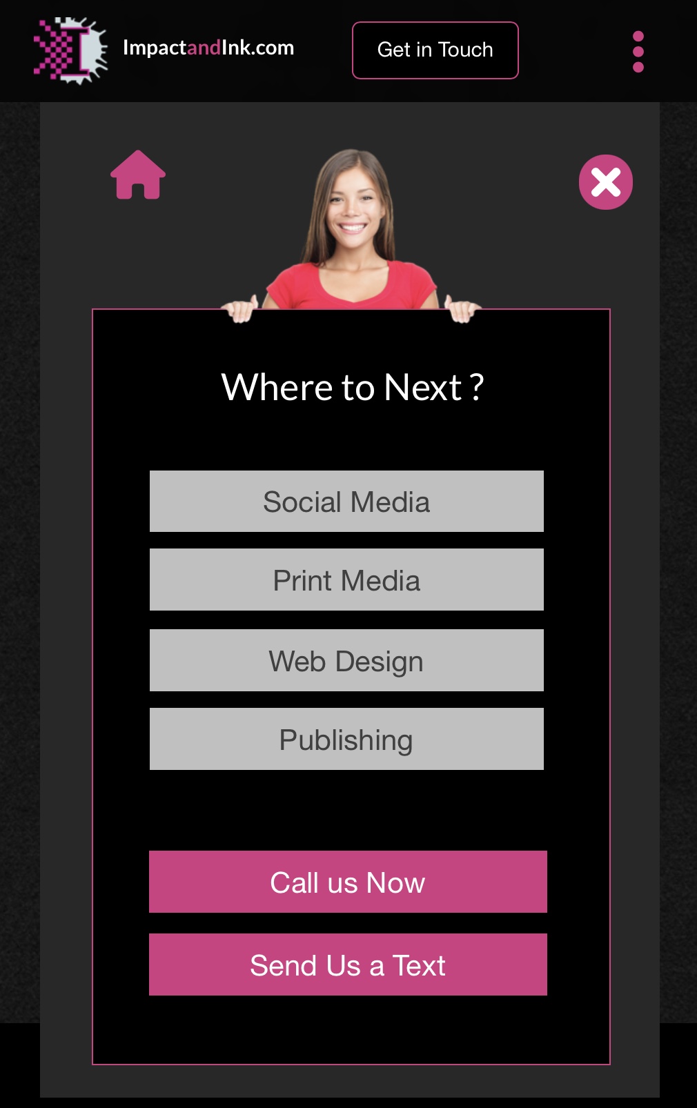
Your menu is fixed to page top, so it’s always visible and active regardless of where a user is on your page. It also retracts when a user clicks on the page - it’s designed to do that to prevent the menu remaining open if no menu selection is made. If you want a mobile menu that prevents page scrolling, it’s better to create it as a pop-up and replace the drop-down menu with a hamburger icon, and have the pop-up menu trigger when the icon is tapped. By setting the pop-up as a modal pop-up, the background of your page will be dimmed while the menu is displaying - preventing users from scrolling.
Personally. I prefer to use pop-ups for mobile menus because they give you greater design flexibility. Even if your pop-up is a “fixed in window” type, you can make it cover substantially the whole mobile screen, thereby making page scrolling less likely. In the screenshot below, i’ve used a three-dot icon as the trigger for the pop-up menu: