I continue to have frustrating problems with elements not behaving the way you would expect them to when pages are “Automatically Scaled”.
It appears that the scale factor used to adjust typographical properties (such as font size, line height) and object geometry (such as size, border width, border radius) are not applied consistently. This results in elements moving around and rendering incorrectly.
I know that some properties are not adjusted at all (such as “rounding” or border radius), while others have some sort of scale factor applied. It is really hard to produce a website that meets accessibility requirements when the design doesn’t behave logically and as expected. I’m aware that layouts can be adjusted per device - but some properties are universal for all devices (such as line height).
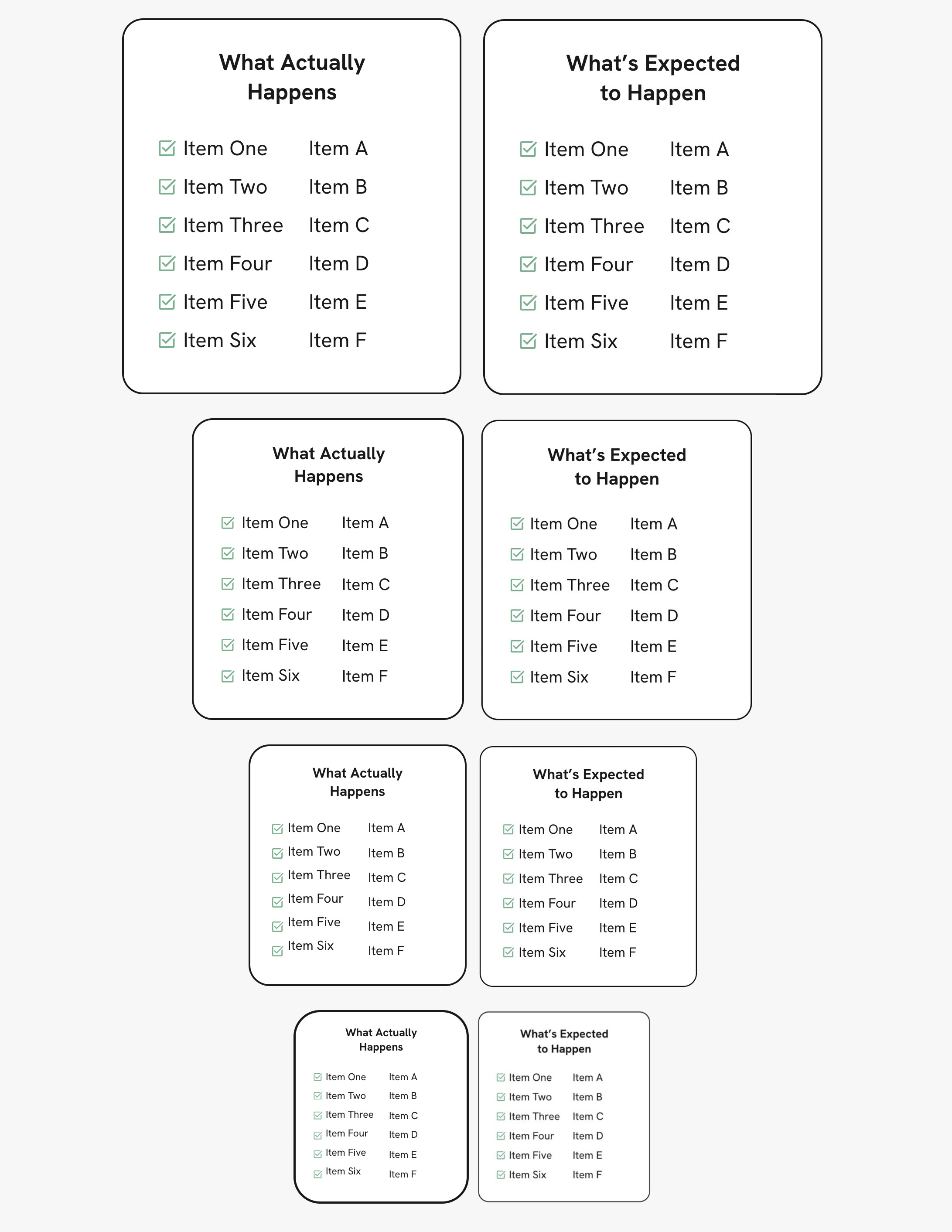
Here is a test comparing what Sitely does vs what I think is a logical scaling. In particular look at the alignment between the check marks and the text.
The issue with borders and border radius not adapting based on the device has come up here in the past, and again recently. I believe (and hope) this feature will be included in a future update. In the meantime, a workaround is to create several background boxes and display only one per device, each with the desired settings. You can hide elements on specific devices from the “Arrange” tab.
As for text, you can adjust line height independently on each device. To do so, go to the “Device” section and uncheck “Synchronize text attributes across devices.” However, in your case, I would recommend simply placing one text box per line/element. You can then space them perfectly using this button located just below the toolbar.
@Allan, thank you for the reply. I am aware of some of the “hacks” you mentioned to address the issue of text properties not scaling proportionally with each other. However, this doesn’t explain WHY Sitely does it this way - any ideas? Is this the intended and preferred behavior? I find that it’s becoming increasingly difficult to manage all the extra tweaks/hacks needed when using Sitely for production websites - maybe that’s just me .
It is worth pointing out. I’ve noticed this behaviour and like @Allan has mentioned it has been brought up a number of times. I’m sure it is being worked on for Sitely V6!
@simkane it is worth mentioning this to Duncan (via email at feedback@sitely.app) in an email explaining what you see, and your logic behind what is expected to happen.
@FlaminFig thanks for the response. I so hope that the whole “scaling of things” issue is addressed in V6 (or maybe 5.X?). I thought @duncan roamed this forum and was watching everything (LOL), but I can email him if that’s really the way to get important information to him.
Is my expectation reasonable? I think it is, the “Automatically Scaled” layouts should scale proportionally without distorting the layout and geometry of elements that are created in Sitely.
@FlaminFig well I guess we will soon find out if version 6 addresses this issue. I just got the email saying that the release is imminent! So, maybe we need to hope this behavior comes in Sitely 7?
@simkane, Duncan is very active in the forum so he will definitely see your post when he arises.
I have noted, Duncan is very appreciative if we send him an email with what we see, how it behaves, and what we expect. I’m thinking it would be easier for him to catalogue on his end, rather then searching through this forum.
@simkane I’m not one of the Sitely developers, so I’m probably not the best person to answer that. However, if you’re asking for my personal opinion on whether this behavior is intended or not, I’d say… yes and no. I don’t think it’s a bug, but I also doubt it’s fully intentional.
Sitely is constantly evolving, but there’s still work to be done. Duncan is aware of that and has even mentioned it here. They have a list of new features and fixes they’re prioritizing, and the app is being refined gradually with each update.
Sometimes, they also face limitations or external issues, particularly related to browsers. Each browser has its own rendering engine, and ensuring a perfectly consistent display across all of them can be a real challenge.
if you wanted/expected a response from me personally, it’s simpler to just email? In our last email exchange I did say that your observations were helpful and to send anything.
So from looking at what you wrote I’d say there are three distinct issues:
layout scaling
border width and corner radius
checkbox misalignment
About layout scaling, it’s been discussed many times (unfortunately search on this forum software sucks), that’s intentional and the rationale is that elements on the page can’t be outside of the canvas guidelines, because it’s not what the layout system expects, so in order to initially add a device layout (or initially position a new element on the device that’s not currently visible), Sitely will use a scale factor that’s exactly the proportion of the current device to the target device. So 1200 → 320 will be 320/1200=0.2666. Again this is the initial scaling, after the initial scaling, if you set the text size for a style on mobile to be 14px, it will stay 14px. A newly added text box will still be sized proportionally, but it will have the text size of the text style it uses.
Why not do something like size the box to fit the text? Well a simple example of the problem is that freeform layout doesn’t have any relationship information of elements, so it can’t know whether text next to an image should become text above image or image above text.
We could do something better than what Sitely currently does, but that’s still something we’re putting pieces in place to make happen, not something we expect to add in v6.
The issue about border width and corner radius is that unlike some other settings, they are not settable individually on each device. This is again a case of an initial simplicity decision that we didn’t get around to address properly, and we should. The workaround has been to duplicate the element and use the “show on this device” appropriately, not great but workable.
The issue with the checkbox misalignment looks like a bug, I have never seen it and a screenshot is definitely not enough to solve it. Please email us a project that produces that issue.
 located just below the toolbar.
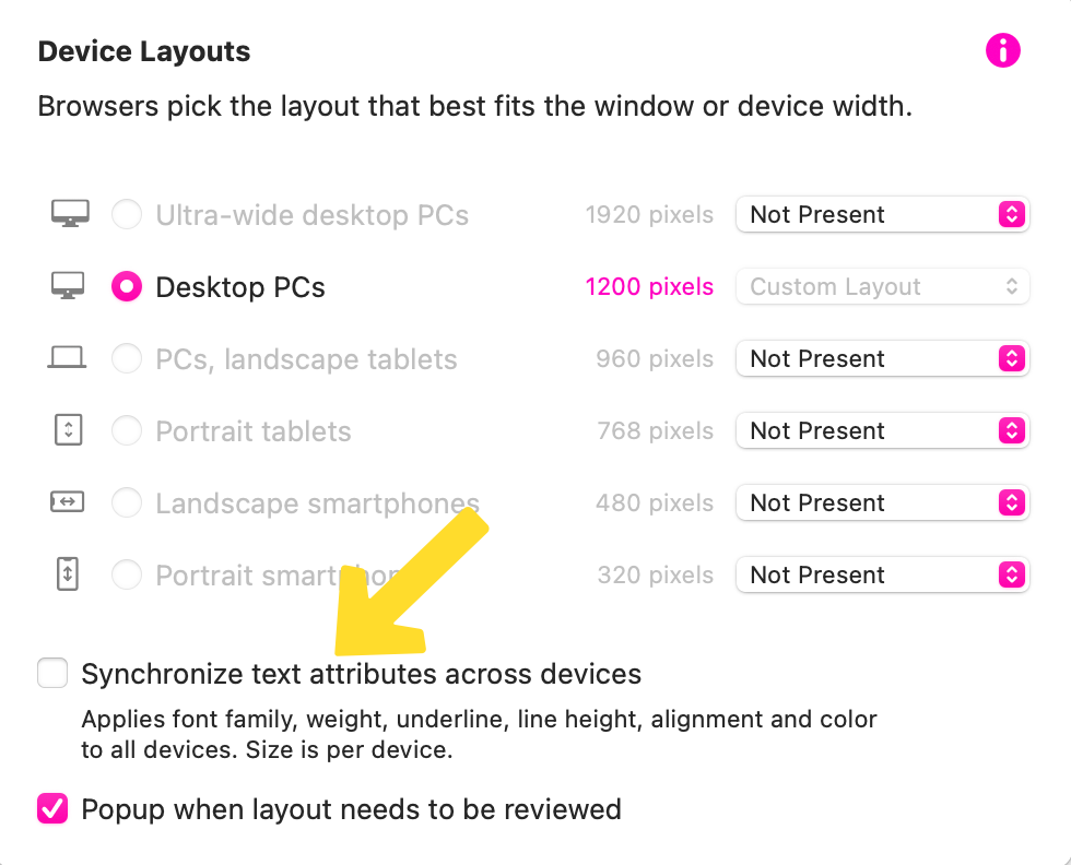
 .
.