Hi! I am sorry for so many questions of late but with the lockdown, I’ve got more time to review and work on those tasks I’ve been putting off.
My first site in Sparkle was for my church and I am trying to get it to look legible on a mobile screen without much luck. It looks tiny. Would anyone here have suggestions on how I can make the it look bigger? There is no problem wth the site when viewing on a laptop.
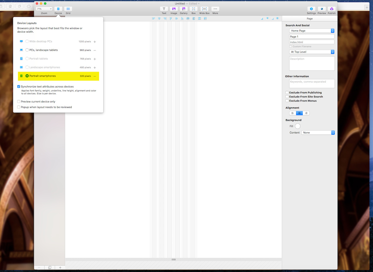
@jazzbird, You need to implement the mobile device which you can find under the tab “Devices”. When it opens you’ll notice it just has the 960 device. From here you can add devices by clicking on the “Customise Device Layouts”.
You will need to add a Portrait Mobile layout and customise it. See attached image.
Best to make mobile (or set your current menu for mobile) also menu. Navigation is super important, fortunately Sparkle does a great job of steering you in the right direction with default options.
Best to add a Portrait Tablet layout white you are at it.
I would add the Portrait tablet layout once I have finished the site, let Sparkle do most of the work and then tweak any page layouts as needed.
Looks like Henrik already answered while I was typing!
So will need to hide the desktop navigation on mobile (right hand panel) and introduce your mobile navigation on mobile and then hide that on desktop the same way. You will then have two independent navigations but sharing the same content.