Hello,
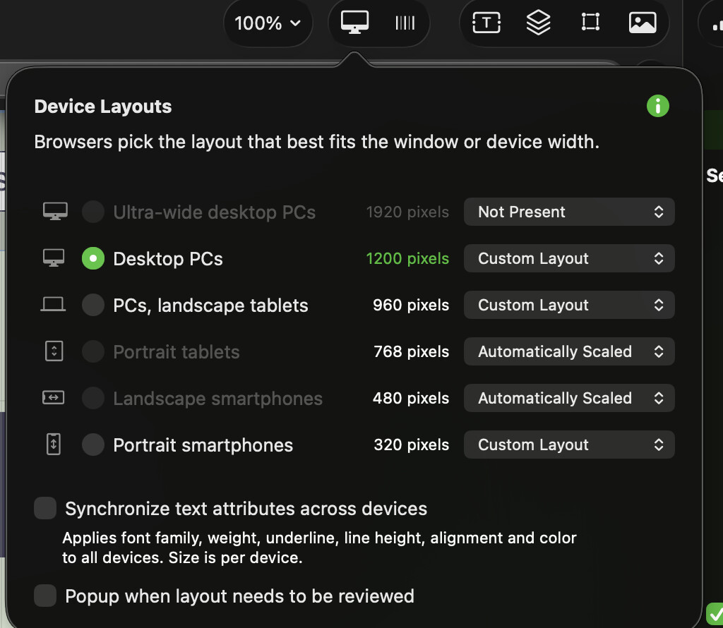
I have recently done a complete update to my website. I have created the breakpoints for a desktop, laptop, and portrait mobile phone, and set the portrait tablets and landscape phones to automatically scale. The issue I have is that once it has been uploaded, the live website on a laptop is displaying the desktop version, which means the text and other items are larger and not what I required. Is there a way to force the website to display correctly on the appropriate device?
My website is sendmeyourcv.com
Thank you all in advance
Just for your info, I have included two screenshots, the first one showing how it should be displayed, and the second showing how it is actually being displayed.
Hi @Sicherry, I can see the issue you are having…
Have you tried adding another auto scaled device (breakpoiint) beyond your Desktop to see what happens?..
Hello @FlaminFig , thank you for your reply. Apart from the three break points that I have custom made, all the other breakpoints are set to auto scale. So in reality, I can’t add anymore.
Ok…
Are you actually seeing this on a physical laptop or are you reducing your browser window to around a laptop sized window?
On a portrait iPad (close to a laptop) all looks like it should.
Yes I am viewing it on an MacBook Air, I have also viewed it on a windows laptop with the same results.
It’s a bit hard to figure things out on this end, so it might be best to get hold of @duncan on feedback@sitely.app showing your file and explaining the situation…
By the way, you have done great with your website! Love it! 

Hello.
I visited your website and see that the problem you described is still occurring. So you haven’t made any progress yet.
As Flaminfig already mentioned, we can’t assess this remotely without having a deeper understanding of the project. It would be helpful to see your breakpoint and device settings. Please post a screenshot here.
We’d also need to know the screen resolution of the laptop in question.
Nice website, by the way.
Mr.F.
@FlaminFig @Mr_Fozzie thank you for the compliment, it did take quite a while to produce the website and it is still a work in progress. I’m am currently away for a couple of days so haven’t been in the position to progress, but as soon as I get back home I will upload some more screen shots to see if it helps.
Cheers
Simon.
1 Like
I just checked the site using Safari responsive mode. All good for any screen size over 1200.
Sorry for the delay in replying, @FlaminFig @Mr_Fozzie The MacBook Air is running at a resolution os 1470 x956, although it is still displaying incorrectly on other laptops too, not just the MacBook. I have attached a screenshot of the breakpoints I have set up.
Hello.
Thanks for the screenshot.
I suspect the error is caused by an automatically scaled layout. Try setting the landscape smartphone view to “not present” and republishing. That way, you won’t need to make any major changes.
Test the new version to see if anything has changed. If necessary, you can revert the setting and republish again.
Unfortunately, that’s all I can think of right now.
Mr. F.
@mistersurefire I have tried it on the response mode, it displays correctly on the 11" iPad but not the 13" version. It is a bit baffling.
Thank you @Mr_Fozzie for the suggestion, I did as you recomended but it did not change anything, and the problem persisted. I’ll contact Duncan directly to see if he can shed any light on it.
Simon.
I saw the same yesterday when i had a look with the response mode tool.
Today (now) both (11" and 13") iPad modes look fine. What happened?
Mr. F.
I removed the desktop breakpoint; I had been in private discussion with Duncan. I know I refer to it as laptop and desktop breakpoints, but the correct term is to refer to the screen width size. So because the laptop is wider than 1200 px, it uses the desktop breakpoint, but in my opinion, it doesn’t look right because the screen is not as deep, which made the above-the-fold content on a desktop screen, made it go below the fold on the laptop screen.
What version of Sitely are you using?
At the time, it was the latest version 6, I have just updated to 7 but not reintroduced that breakpoint yet