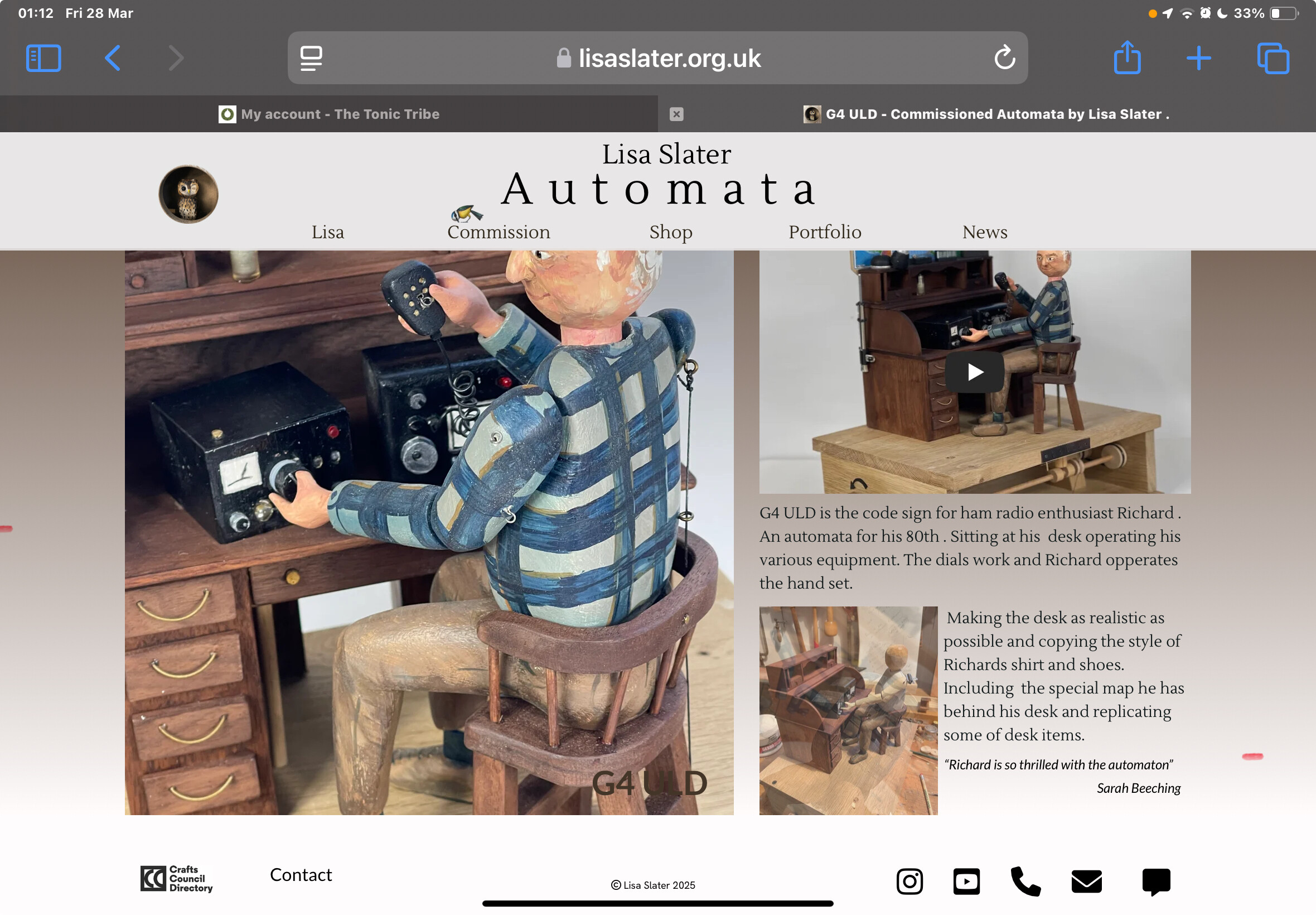
Hello. I am getting much better on my web site building. Site now re vamped and it’s looking good on 15” Mac book air ( which I built it on) and i phone. I found the tutorial on looking at the site in developer most helpful. Thanks
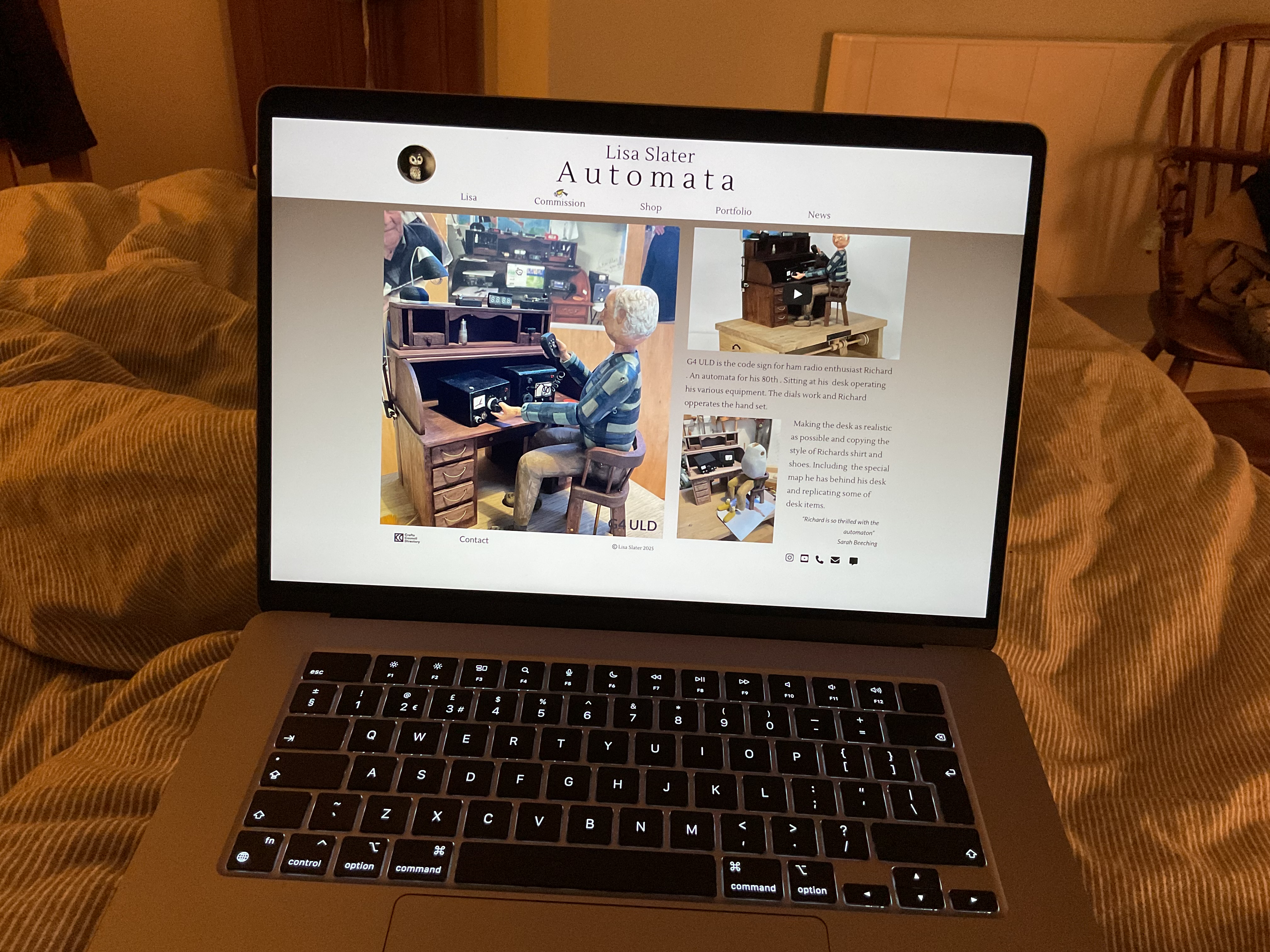
So my question is ? Today I download fire fox, chrome and Microsoft browsers onto my old (2015) 13 inch mac book pro to see how it looked across different systems. On this device the Home Screen is not fitting yet it does on the iPad landscape with footer nicely at the base. Can someone tell me what I need to do. I spent time making the page smaller but then the footer was not nicely placed when I looked back at the iPad so reverted.
Usually, a custom layout for desktops and portrait-mode smartphones is sufficient. For the rest, you can set it to “Automatic Scaling.” Have you tried that?
Hi Allan , I tried that this evening changing the tablet and pc devices setting to auto scaling. Looked better on 13” Mac book after some adjustment of the footer but totally rubbish on iPad , content no longer fitted on the screen so reverted to switching back on tablet devices.
I just saw your latest photo. What’s bothering you is that on your 13-inch MacBook Pro, you can’t see the bottom of your site, right? That’s due to your screen’s format, this is completely normal. Every screen has a different resolution and aspect ratio, so your site will never display exactly the same way on all monitors…
Yes thanks , a better understanding now of why things don’t look as wished.
At some point I may play with the design size so it looks balanced on both a tablet and smaller lap top. But for now the tablet compatibility I think is priority.
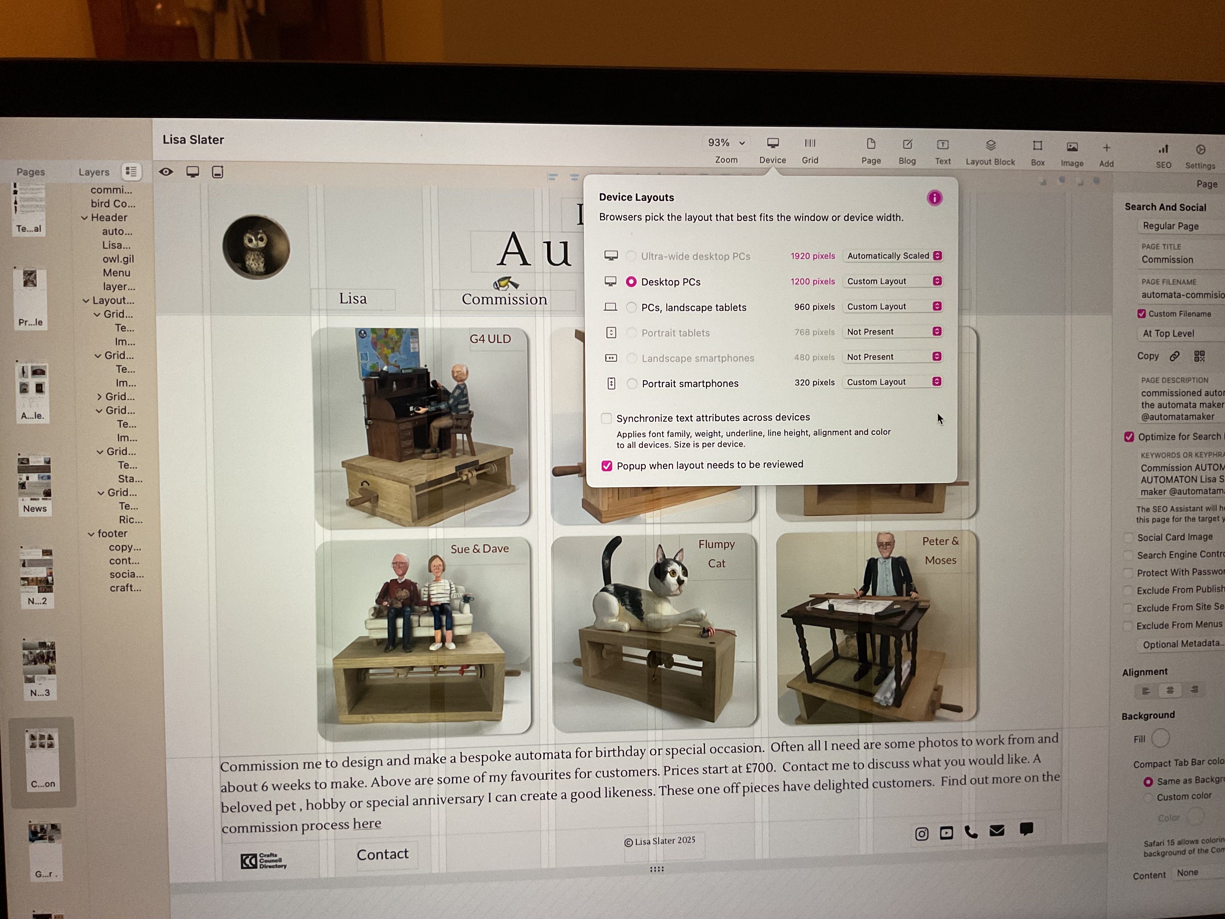
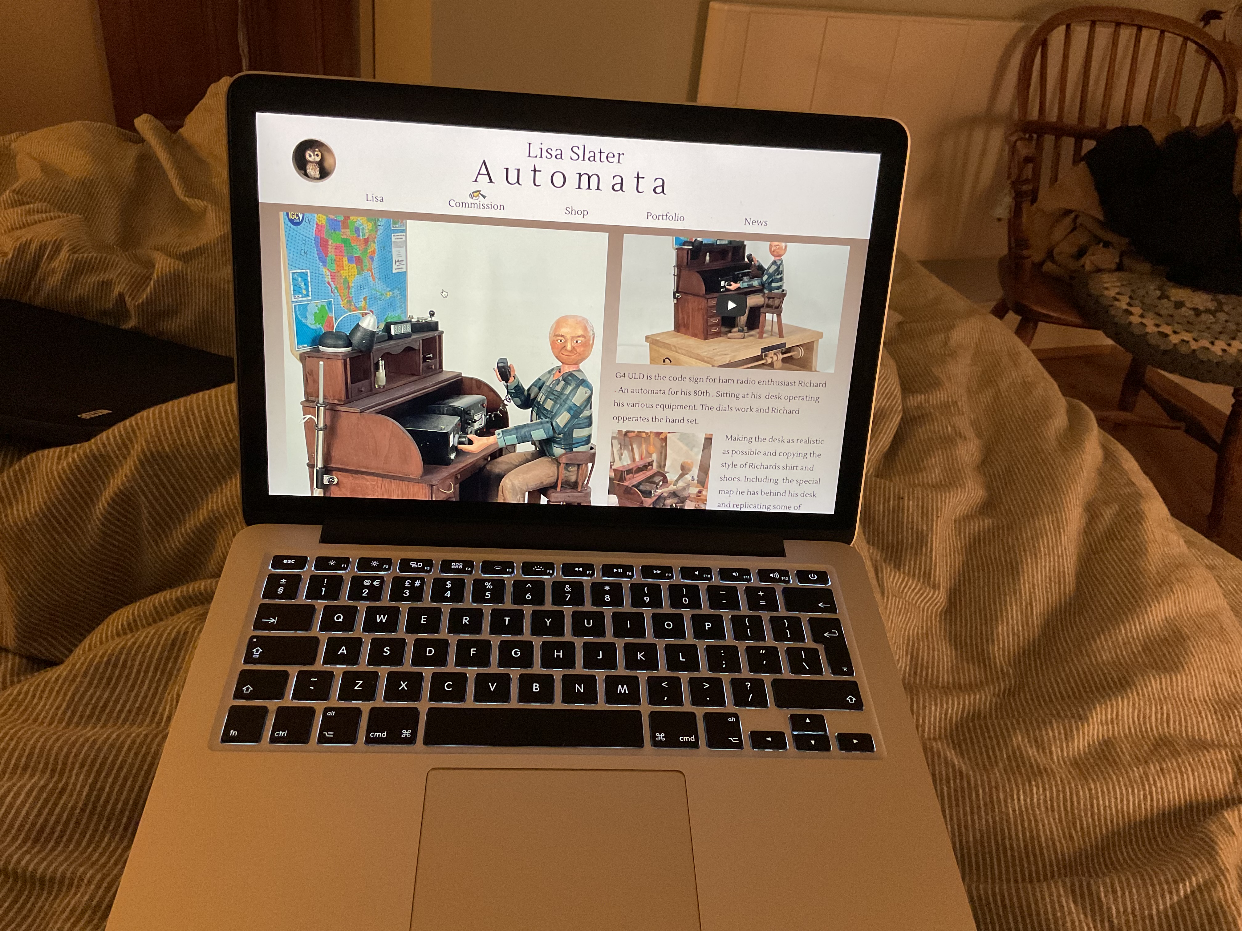
From your first image…
If you introduce Portrait Tablets and you Automatically Scale it then your tablet layout will look more the part.
With your two following MacBook Air images…
Sitely works by what is called fixed-width responsive layouts. So your 960px on your 13’ is nearly marginless while on the 15’ you have side margins. This is normal behaviour. The 15’ is still using the 960px Device like what your 13’ is using.
Thanks for your advice
The page design is not to my satisfaction with the footer so high up on the bigger screen devices. Is there any way it could be set to stick to bottom of page when looking at a larger screen device.
I designed on 960 setting. Great for tablet. But looks poor even with auto scale on larger device.
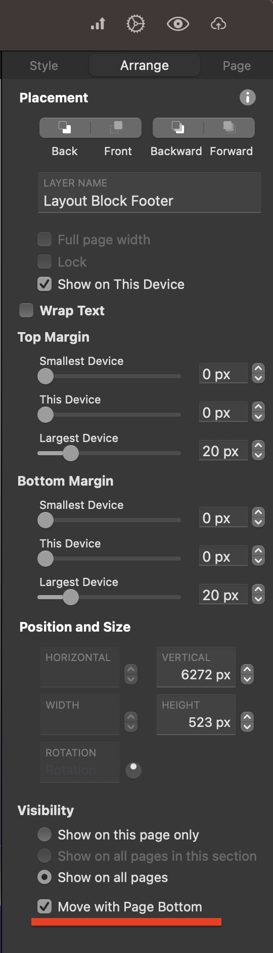
What I would recommend, if you haven’t already, is place all of your footer content in a Layout Block. Once done click on the Layout Block and then go over to your Arrange tab on the right hand panel, and down the bottom of the Arrange tab you will see Visibility / Move With Page Bottom, like what you see in the attachment.
Also lengthen your page somewhat to get the right distance.