With much gratitude for insights, is there a setting to force an output page to reduce margin sizes? The canvas width seems unchangeable.
To use research apps on a desktop display, it can be expedient to have two or more app windows visible on the limited desktop real-estate. We might follow a user manual or a video to learn an app procedure. Screen real-estate is validly a key feature.
On my www htmls from Sitely, by reducing window widths, the text elements can get cut-lines, (or rarely with imported htmls, elements occasionally, arrive floating atop one or another element. Understandably, visual-object overlaps are hard to solve for all display variables out there; however, here is a deserving clarification and possible fixes?
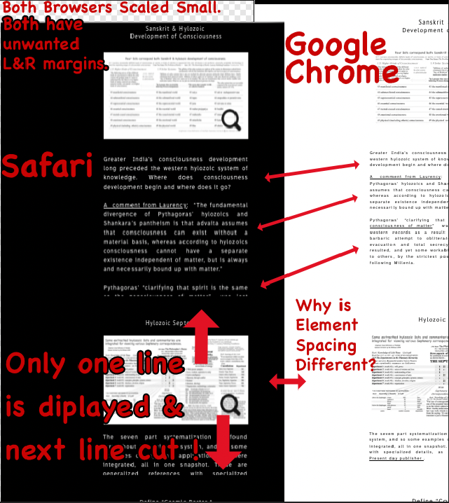
As seen in the left of image, Safari v 16.6 on OSX-12.6.8 actually cuts off most of the text box, while Google Chrome keeps all text boxes whole. These example are on a 1080p OSX display setting. Safari demands a much wider window before it displays correctly.
I’m trying to use approximately 500 pixel text box widths at page center. Many images are mostly placed between 2 short text blocks, with many on a page. How can this arrangement be forced like thousands of other pages to bear considerably down-sized page widths, (that is margin widths), on a desktop screen?
Many of visited sites allow a small width adjustment for margin and text display, but not my outputs from Sitely.
Where are controls found for for margin settings? Canvas width settings are not found either. Site Search Results
Can I ask if the browser windows are exactly the same width?
Sitely is a fixed-width responsive web design platform. In other words the website will format (requested from the hosting server) to the device that is requesting it. If you play with the width of the browser window then you will notice weird things in-between devices (aka, breakpoints). This is totally normal for a fixed-width responsive layout.
I’m thinking the font line-height spacing that you are highlighting is a Safari bug… one that has been going on for years! 
The version of the site displayed in a window will depend on the devices you design for. As the window is reduced in size, another breakpoint will kick-in. For most situations, this works well, but it is contingent upon designing for all breakpoints, rather than just a desktop and mobile version. If you design for every breakpoint (tablet landscape and tablet portrait) you should overcome the issue quite cleanly. As you’ve already alluded to, there will be a few in between situations where window sizing can fall between breakpoints, which can create an issue for users. However, most users will quickly realise that a slight adjustment of the browser window will display the site correctly.
I didn’t know about a “font line-height spacing”… Bug? Yes 
Correction- Thanks everyone, it makes sense. …
My last cell phone was in the 1990s, so I check my sisters iphone once every two months. gotta get that infra-red face scan, heh, heh.
PS- While importing many files plus editing… A wonderful Sitely feature was found: After (so called) Import website command, the preview box for a single webpage shows up…
At that point, a variable-width page can be made narrower, by dragging the box edges. Excellent! Then click import and not before.